24_C+S | MSM. Masterplan San Marco, Conegliano

Category
Italy

NAME

Designer or design team: C+S Architects, Carlo Cappai, Maria Alessandra Segantini
The project has been submitted by: Ente banditore, Ordine Architetti Milano

Plot area: 7.000 mq
Gross Area: 6.000 mq

Of which
Residential: 70%
Public/communal areas: 30%
Facilities for the public: 30%
Business/trade: 0
Offices: 20%
Number of residential units: 30

Typology of users: families, temporary residents, other
Total building costs: 7.000.000,00 €
Building Cost = Total Building Cost / Gross Area: 1.116 €/mq
Floor area ratio = Gross Area / Plot Area: 0,8
Work started on date: Monday, 31st July 2006
Work completion date: Friday, 30th November 2012

OWNERSHIP
A.T.E.R. Treviso
Promoter: A.T.E.R. Treviso
Allotment rule: Rent
Reduction cost percentage compared to the market value:
assigment and rent: 0%

LOCATION
Country: Italy
City/town: Conegliano
Address: viale Spellanzon

Description of the project:

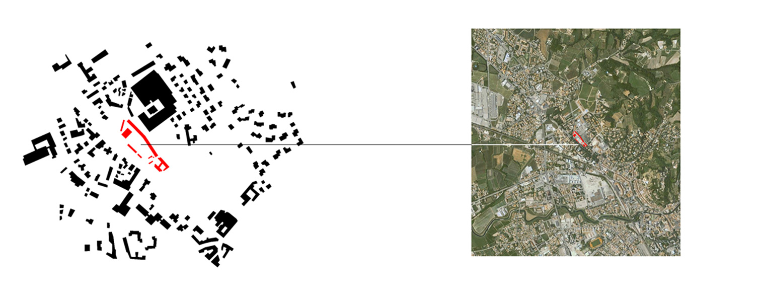
The former military structure of the Caserma San Marcoʼs army square is a huge void at the entrance of Conegliano historical city centre. Avoiding to give answer to the expected programs through conventional solutions, we have considered this masterplan as a great opportunity to regain and activate a non-used marginal space of the city.

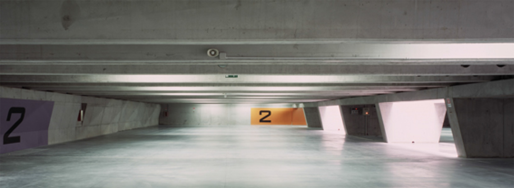
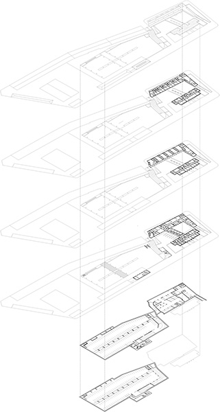
Densifying the edge of the plot with social housing and public facilities, the design aims to preserve the square and to engage and activate programs which can involve larger communities more than the neighborhood. The main idea of the urban renewal design is based on shaping empty spaces, above and below the ground. The notion of void is investigated from at the urban scale as well as at the architecture and detailed scale of the structure of the buildings. Underground, the two-storey parking lot is shaped by the structural design, freeing it from any intruding plants or systems, which are

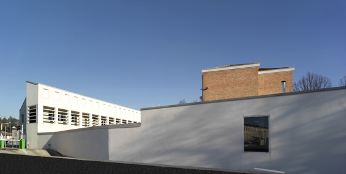
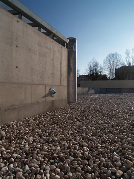
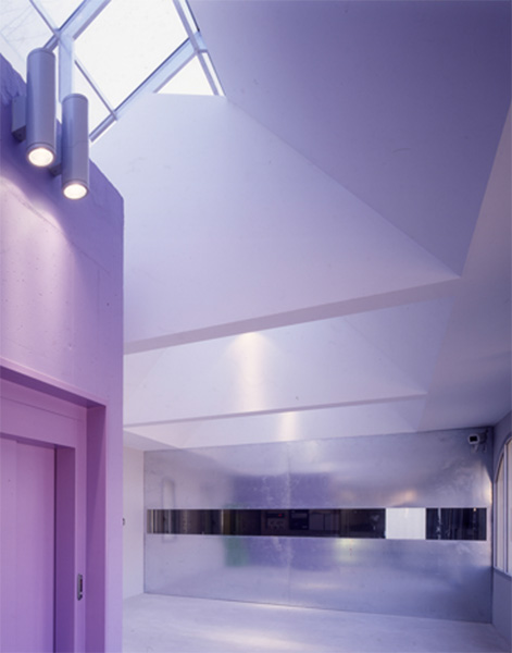
concentrated in the central shaft. A system of pillars, which opens up like a tunnel, lets the natural light to go through, provides ventilation and is the support for the horizontal elements, with alternated sections, creating a 16 metres wide free span. Color outlines the parking orientation signing the security exits. The grafic signs, in this project, become spaces and, viceversa, space becomes a grafic solution. The concrete blades with emergency exits are coloured in green, orange and purple and covered by canopies, which are the only outside signs of the underground parking on the outside artificial public space of the new square.

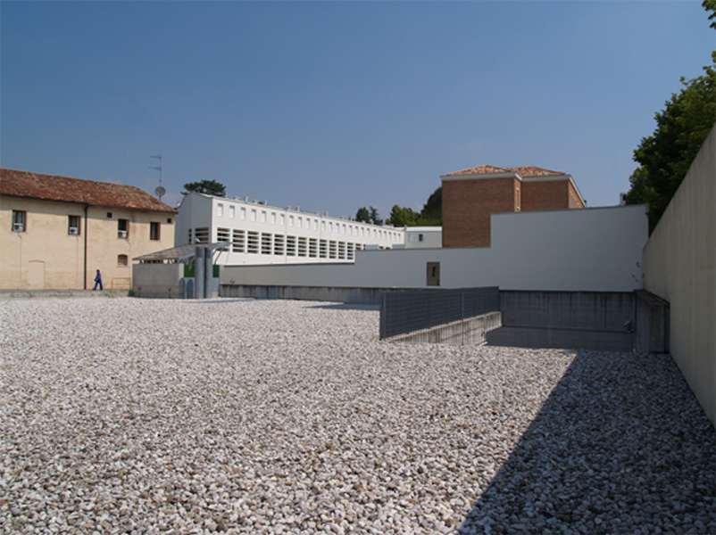
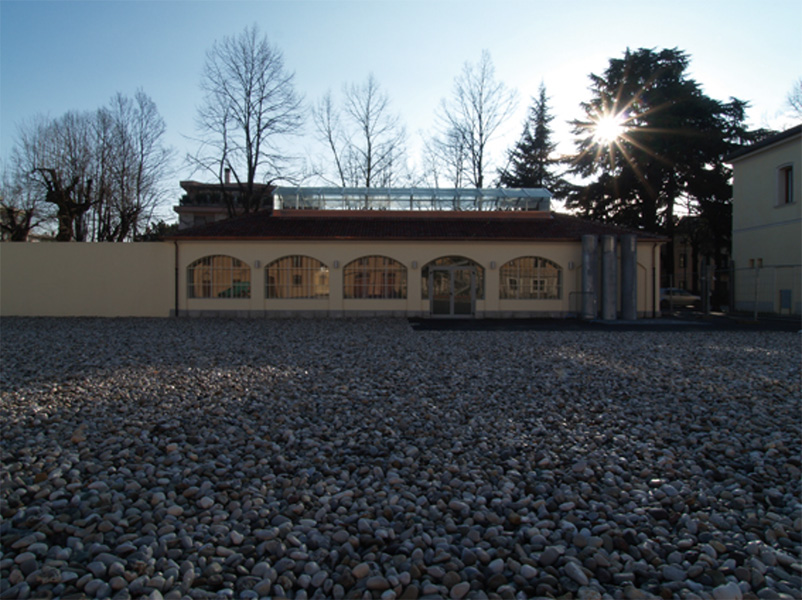
Above the ground the void is preserved through materiality. The square is entirely covered with the stones of the Piave River and it is crossed by one single path, made of larch boards. This low-cost solution was shared with the people, freeing the space from car parking and allowing different possible uses of it, as concerts or markets.

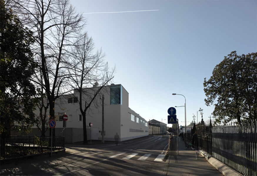
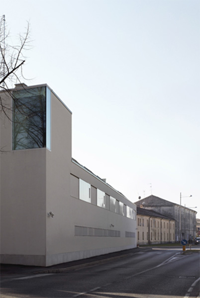
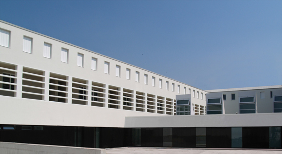
The refurbishment of an existing building houses the ticket office, connected with the underground parking. Even the dense social housing and services is shaped around the void of two courtyards. The houses are served by a balcony and each of them has an entrance either from the ground floor either from the first floor, at the streetʼs level. The smaller typologies for young people face directly on the courtyard and are enlightened also by roof windows, while the larger apartments are duplexes entering from the balcony.

From the outside the building follows the edge of the plot in continuity with the existing buildings. From the outside the building follows the outline of the plot, keeping the continuity with the existing buildings.